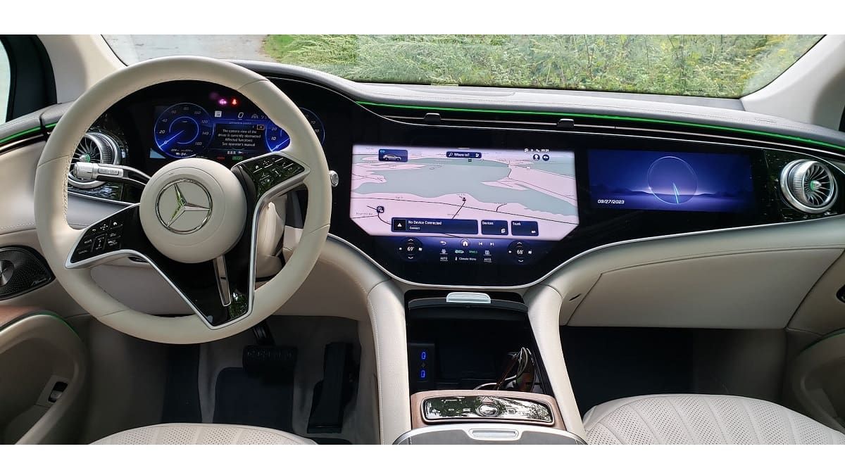
Ever since Tesla glued a table to the dash of its Model S, automakers have been of the impression that more is better when it comes to infotainment screens. The best copy and improvement of the Tesla screen we have tested is Ford's. The Ford folks turned the screen on its side, added a lot of popular features like Android Auto and Apple CarPlay, and gave the screens some flavor. However, nothing we have seen in any vehicle quite matches what Mercedes has done.
Related Story: 2022 AMG EQS Review: Single Thing That Made a Female Friend Like This Vehicle
Mercedes-Benz now offers its EQS series of sedan and SUVs with a screen array stretching from one end of the dashboard to the other. We took out a tape measure to see just how lengthy that is, and discovered it is 44 inches left to right. At its center point, it is about a foot high. It’s not one screen, but many, and each has its own features and even its own targeted user.
The driver information display is the one directly in front of the driver, seen through the steering wheel. This is your usual trip odometer, fuel economy info, range and efficiency data, speedometer, of course, as well as the vehicle status and warnings area.
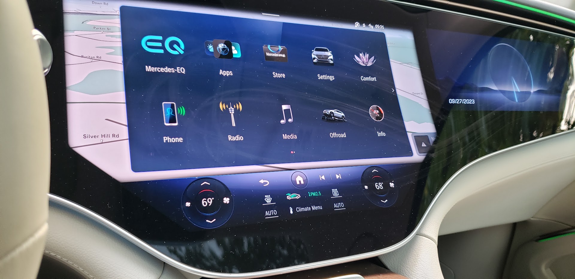
The center display acts as the primary infotainment hub. You control things like audio, video, navigation, and, when safe to do so, all of your settings. It has just about everything you could imagine short of a volume knob. This screen offers outstanding clarity, resolution, and response time. It is among the best we have tested in any vehicle at any price point. Which, for the Mercedes Benz EQS 580, is roughly $130,000.
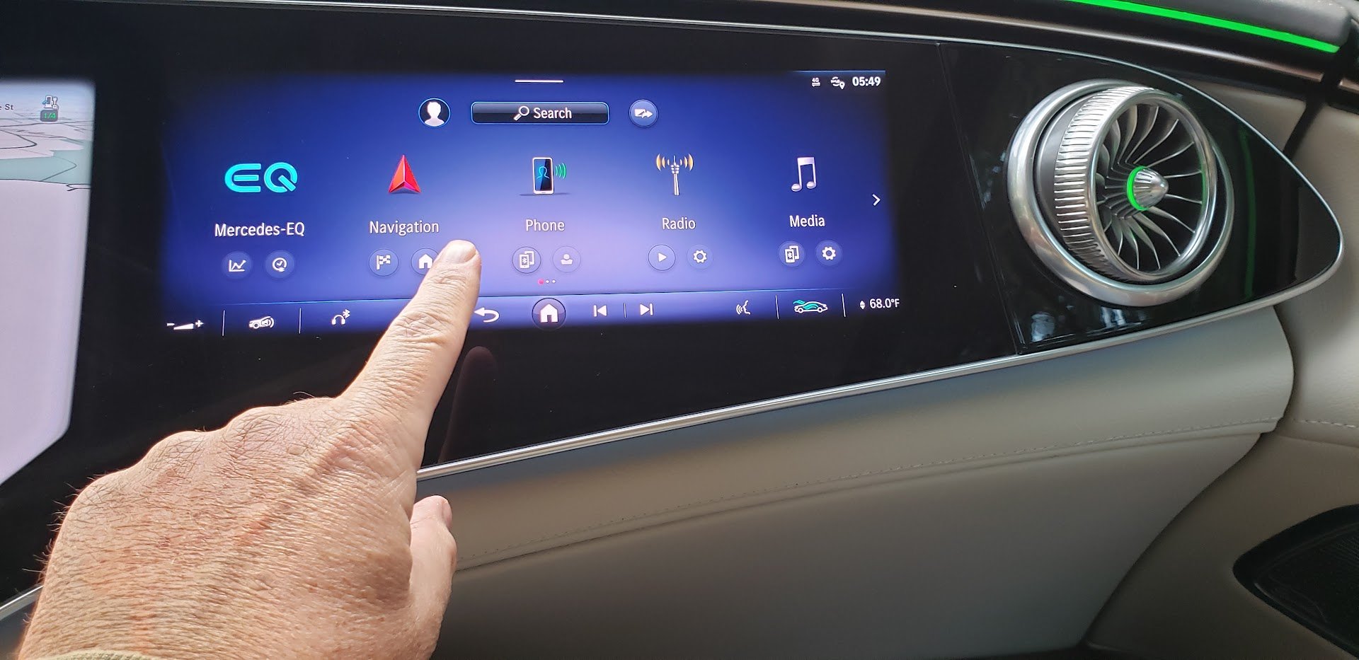
To the right of the center display is a display just for the front passenger. Why not? This allows the passenger to take an active role in the infotainment selection without having to lean to the side and peck at the center menus.
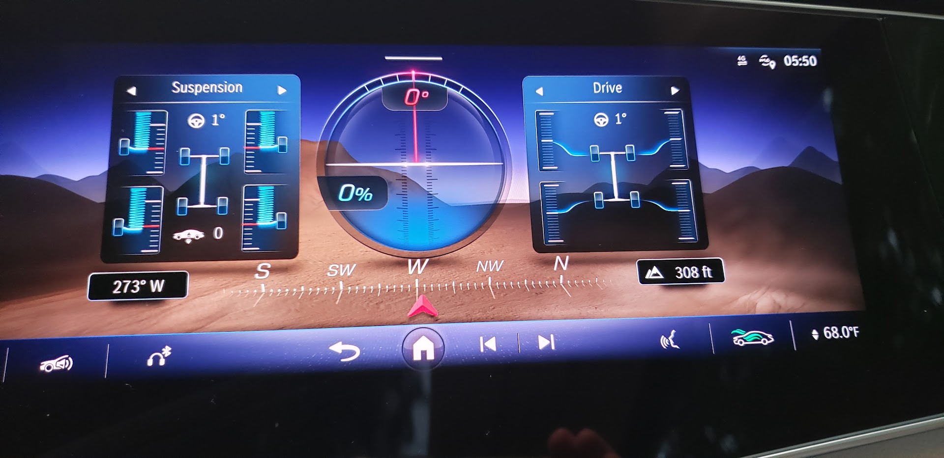
Your off-road angle gauges are located in the passenger display as well. You know, for when you take your summer-only tire-equipped huge EV “off-road.”
What doesn’t photograph well is the head-up display, which is among the best we have ever experienced. It, too, is large, spanning left to right about twice as far as anything else we’ve seen. Like all HUDs, it is adjustable. Don't like it? Don’t use it. Want it to be simple, no problem. Offer everything? No problem. You can decide.
Android Auto and Apple CarPlay are included and wireless. That means this system trumps the one in the Genesis, Hyundai, Kia EV line, which oddly still require cords, at least as far as our last test vehicle.
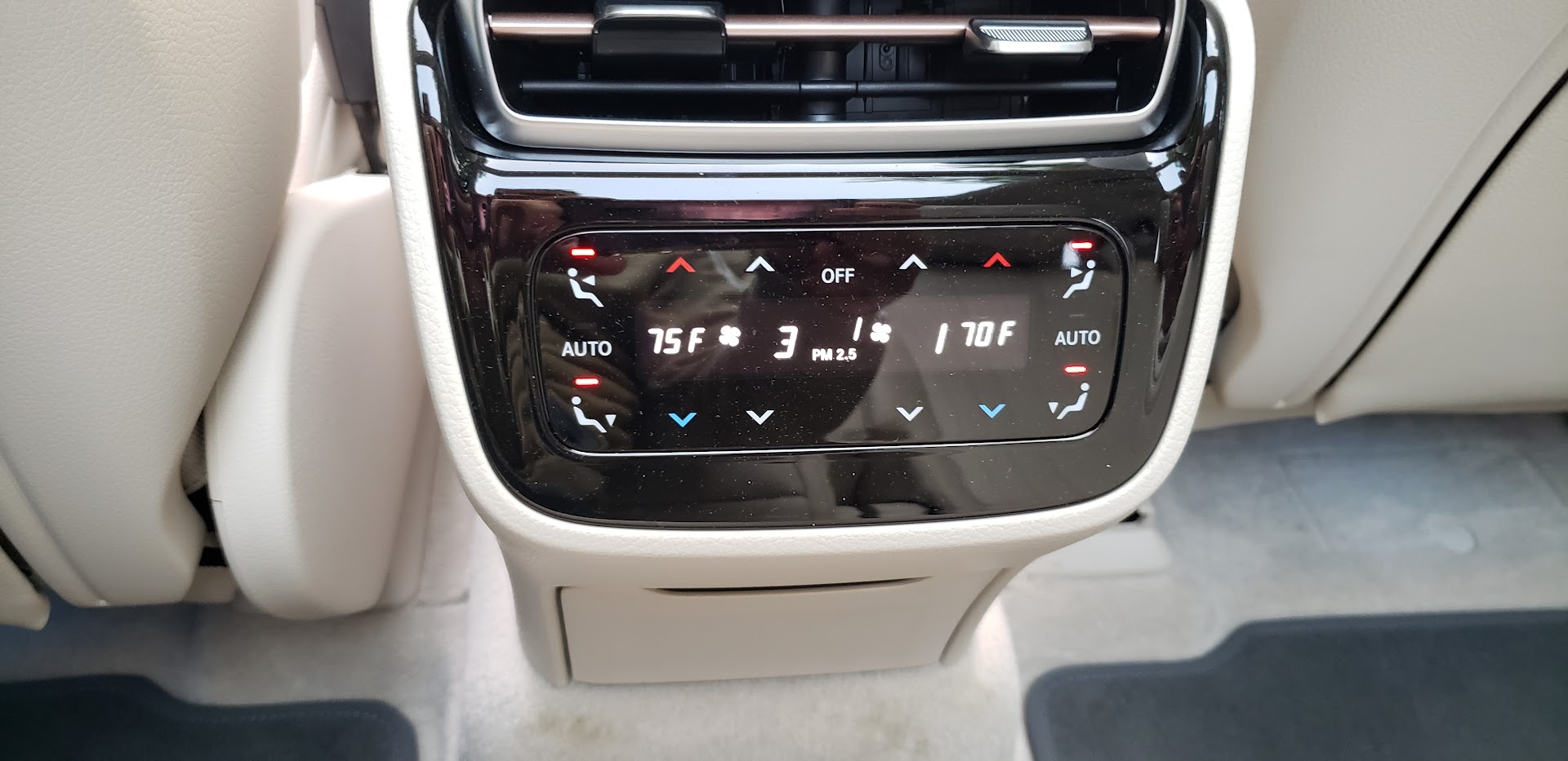
There is a smaller control screen in the rear of the EQS as well (of course)
Ratings For the Mercedes-Benz EQS Infotainment System (10 is Best)
Ease of Use = 9 (add a volume knob, and it’s a 10)
Visual Clarity = 10
Information = 10
Audio = 10
Width = 11
Height = 10
Colors = 10
Android Auto and Apple CarPlay Integration = 10
HUD = 10
Passenger Participation Score = 10
Total Score = 100/100
As you can see, the Mercedes-Benz EQS Infotainment System scores a perfect 100/100 on our ratings due in part to its “11” score on its width. What makes this entire system so good is that we operated without any tutorial, without peeking at the manual, or without much hunting and pecking. It all works intuitively if you have used any modern infotainment system in any vehicle. We are pleased that we can report the system is not a gimmick but actually works and works well.
Images of the Mercedes-Benz EQS Infotainment System by John Goreham.
John Goreham is an experienced New England Motor Press Association member and expert vehicle tester. John completed an engineering program with a focus on electric vehicles, followed by two decades of work in high-tech, biopharma, and the automotive supply chain before becoming a news contributor. In addition to his eleven years of work at Torque News, John has published thousands of articles and reviews at American news outlets. He is known for offering unfiltered opinions on vehicle topics. You can follow John on Twitter, and connect with him at Linkedin.

